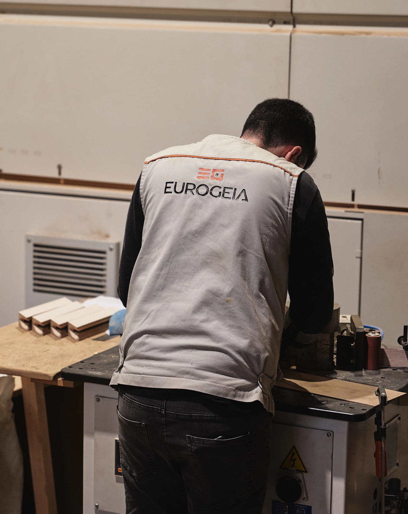
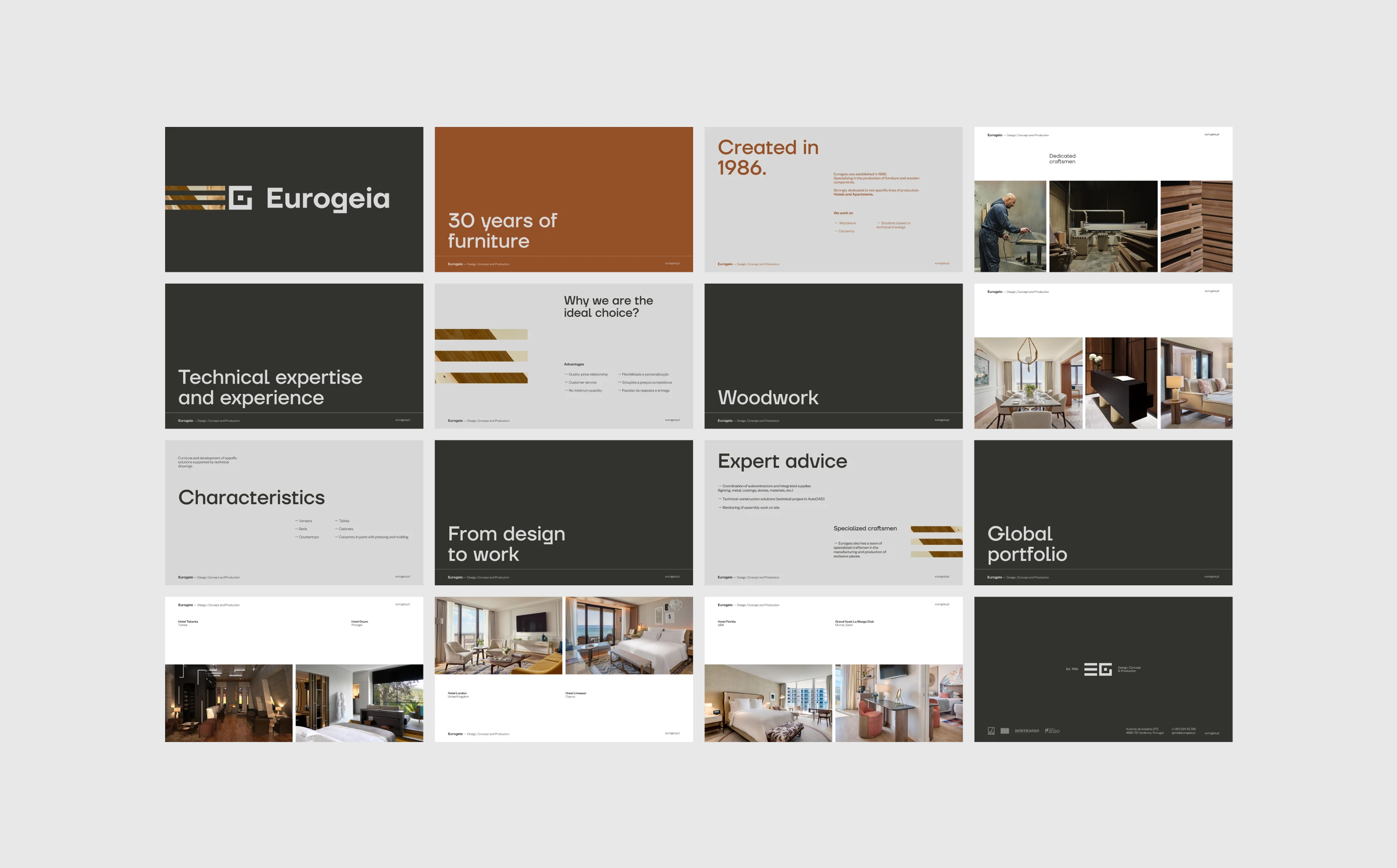
Eurogeia is an industrial company specialized in the production of wooden furniture and components, with a particular focus on two segments: Hotels and Apartments.
With a strong emphasis on quality and innovation, Eurogeia stands out for creating products that combine sophistication and functionality.
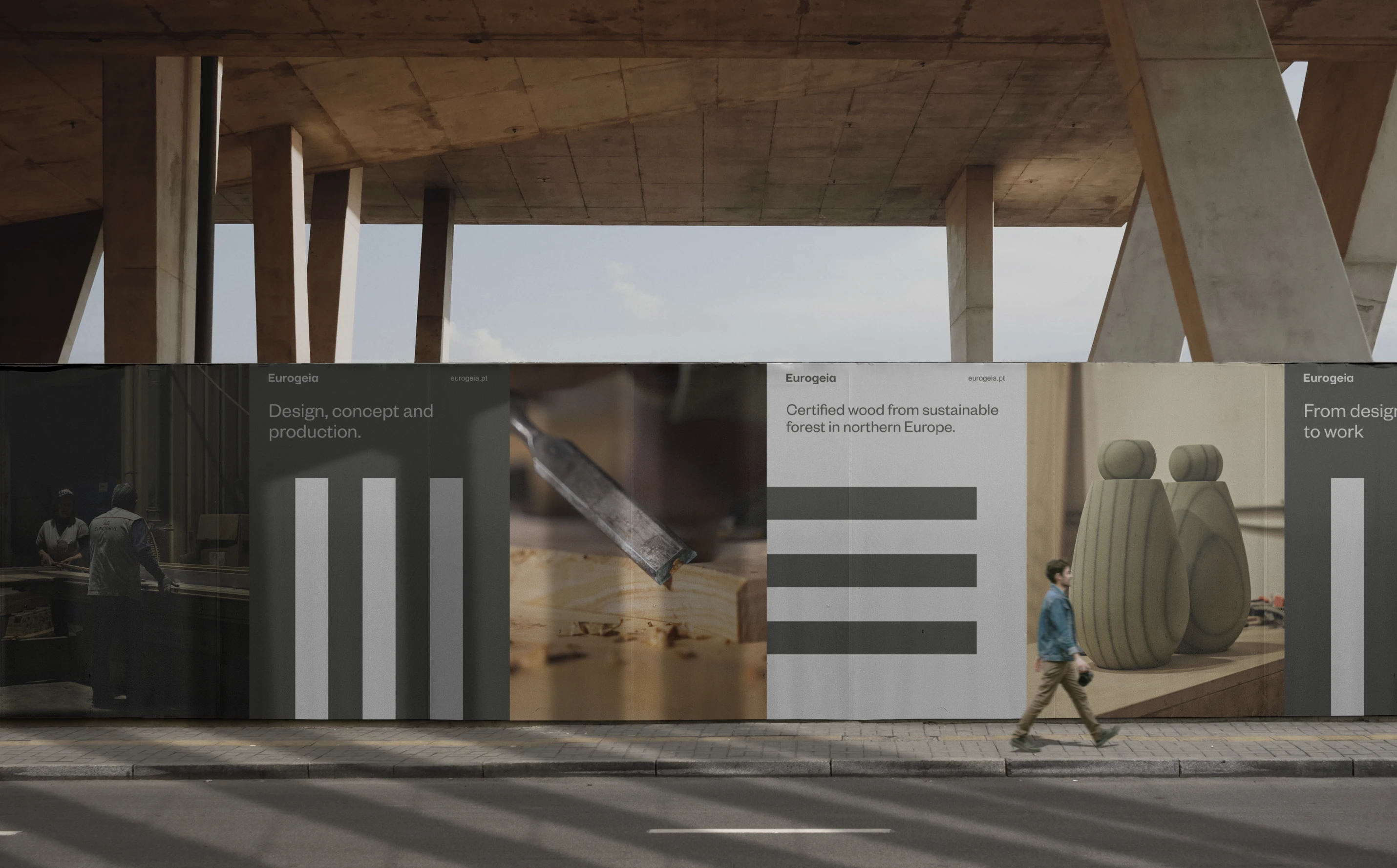
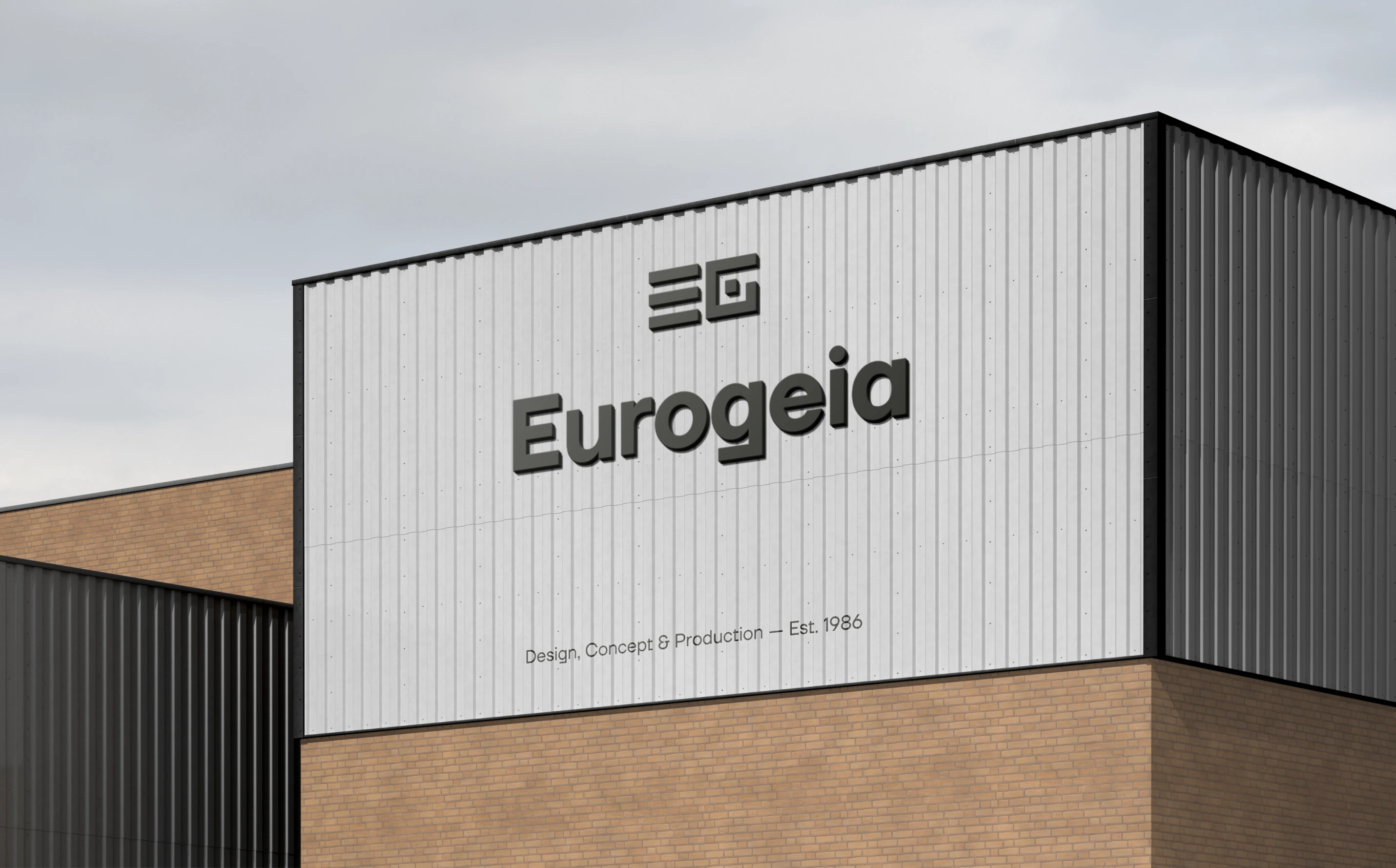
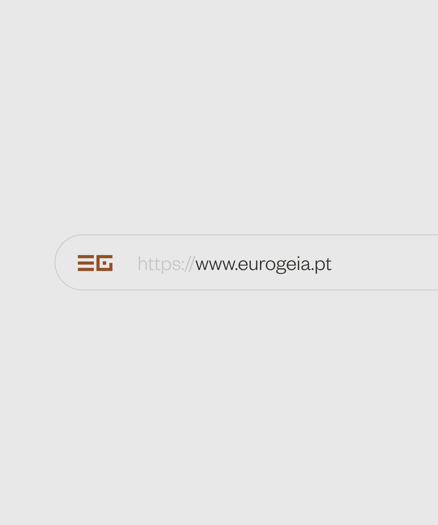
The rebranding of Eurogeia aimed to modernize the brand's visual identity, simplifying the logo and making it more current, while maintaining the essence that makes it unique.
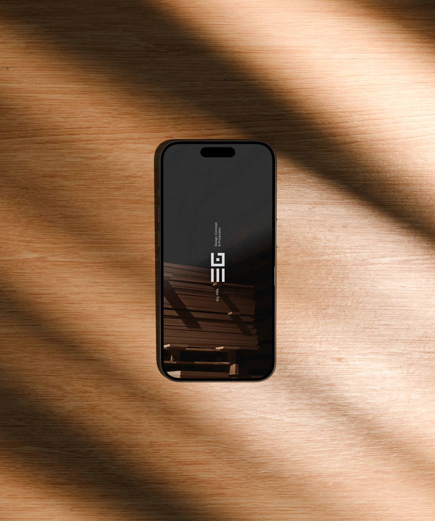
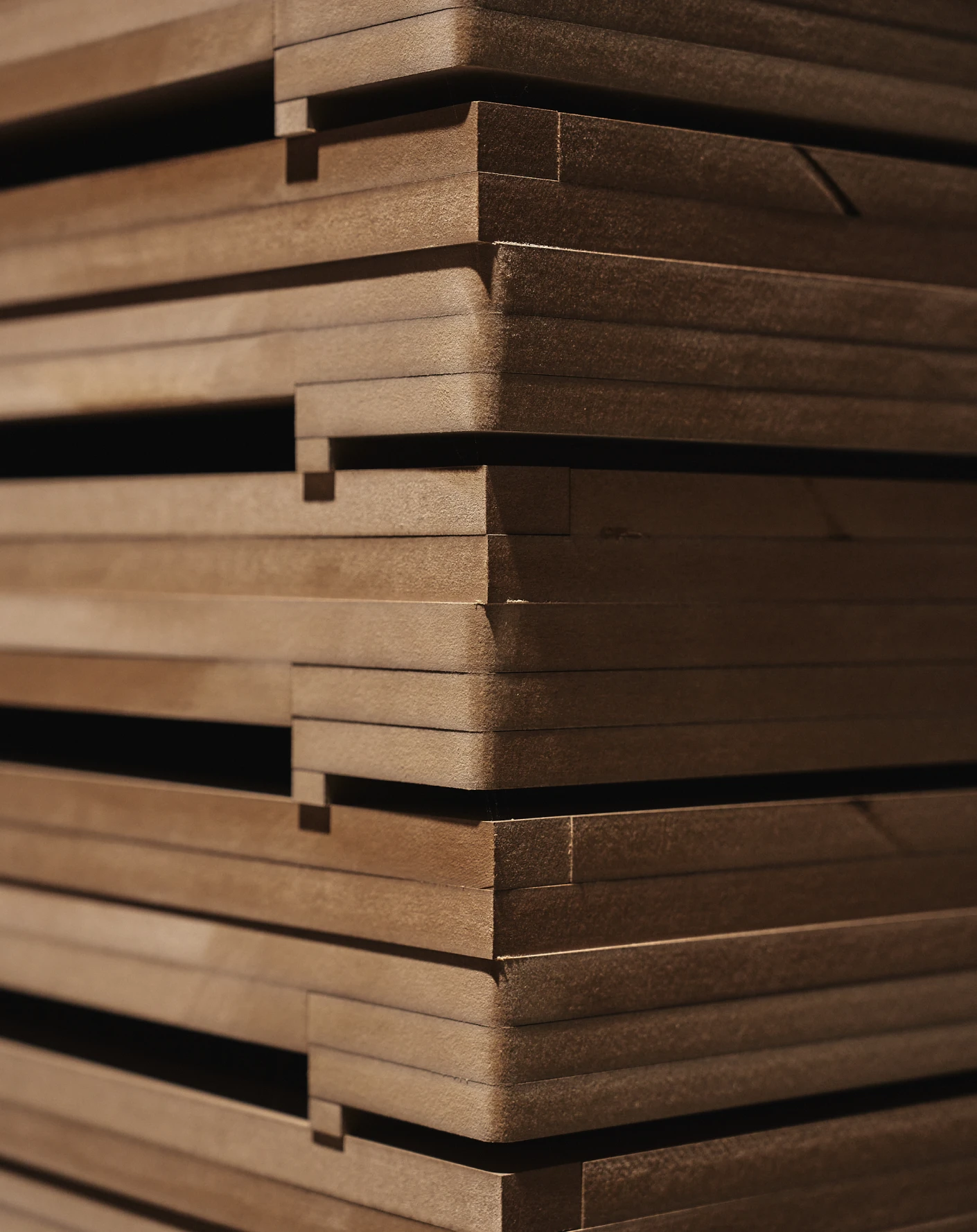
The new symbol simplifies the original design, creating a cleaner, modern version that still reflects Eurogeia’s authenticity and product excellence. It retains the wooden slats, symbolizing the brand’s quality and tradition.
Diversity is the strength of the brand, a manifesto of inclusion and unity. Rebounty is an inclusive brand by everyone and for everyone, a brand that champions gender freedom and diversity. Choose your colors was the chosen motto.
Img. 1
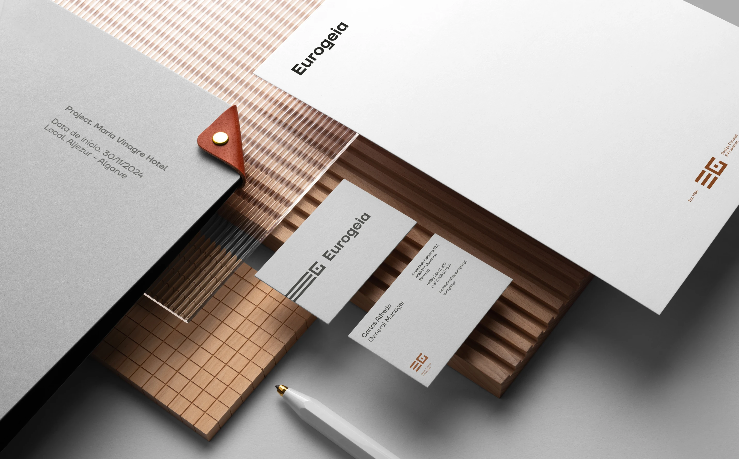
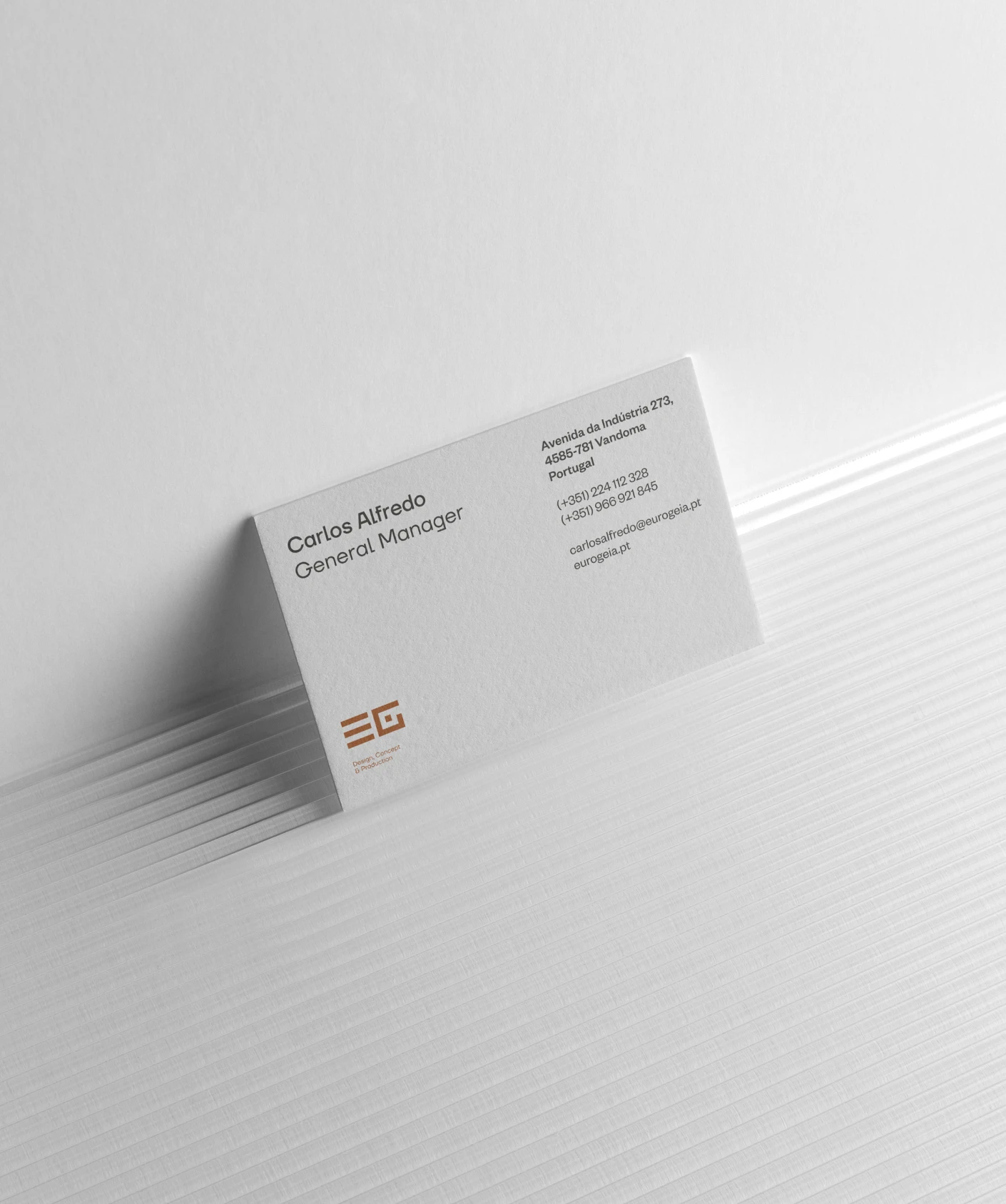
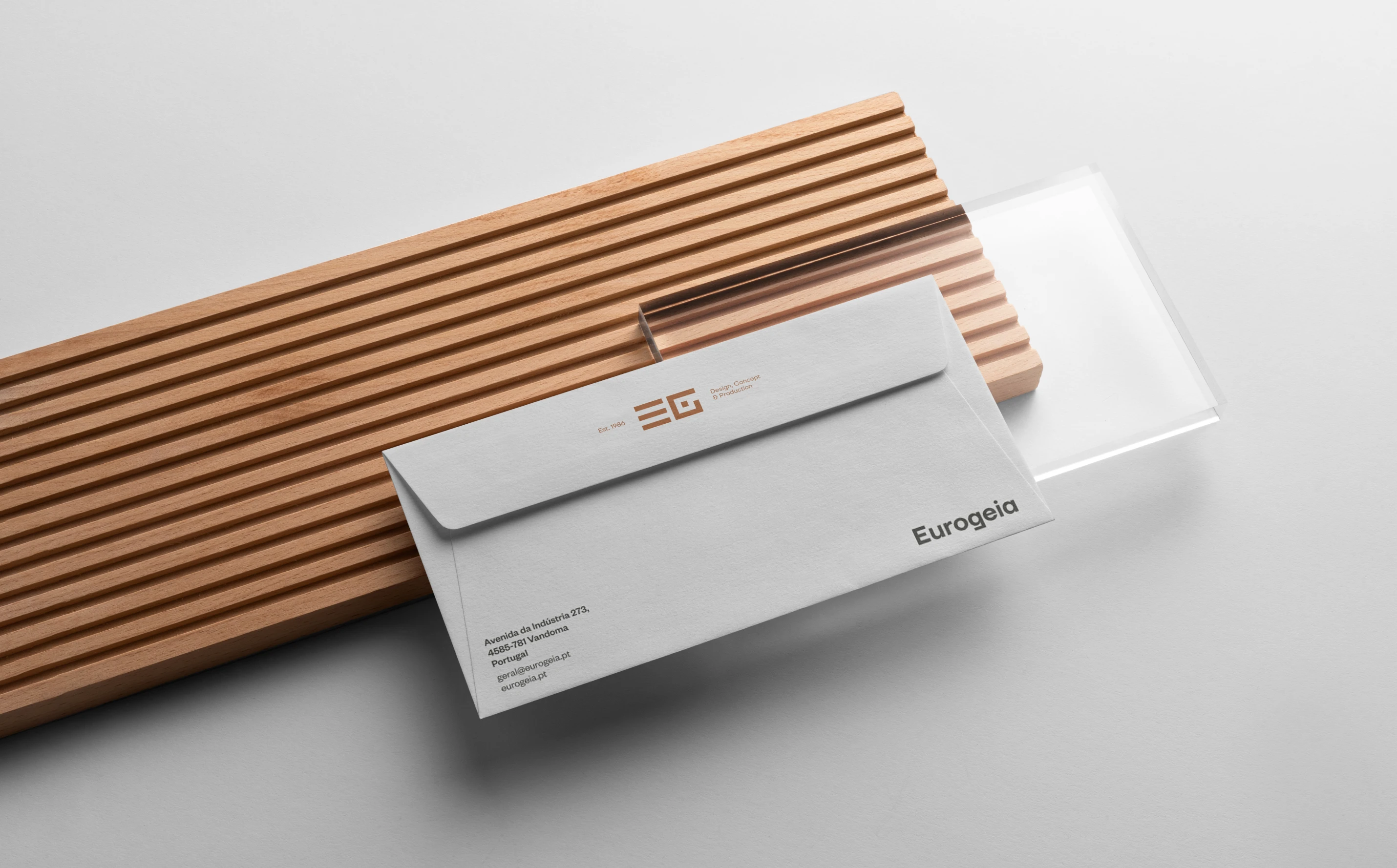
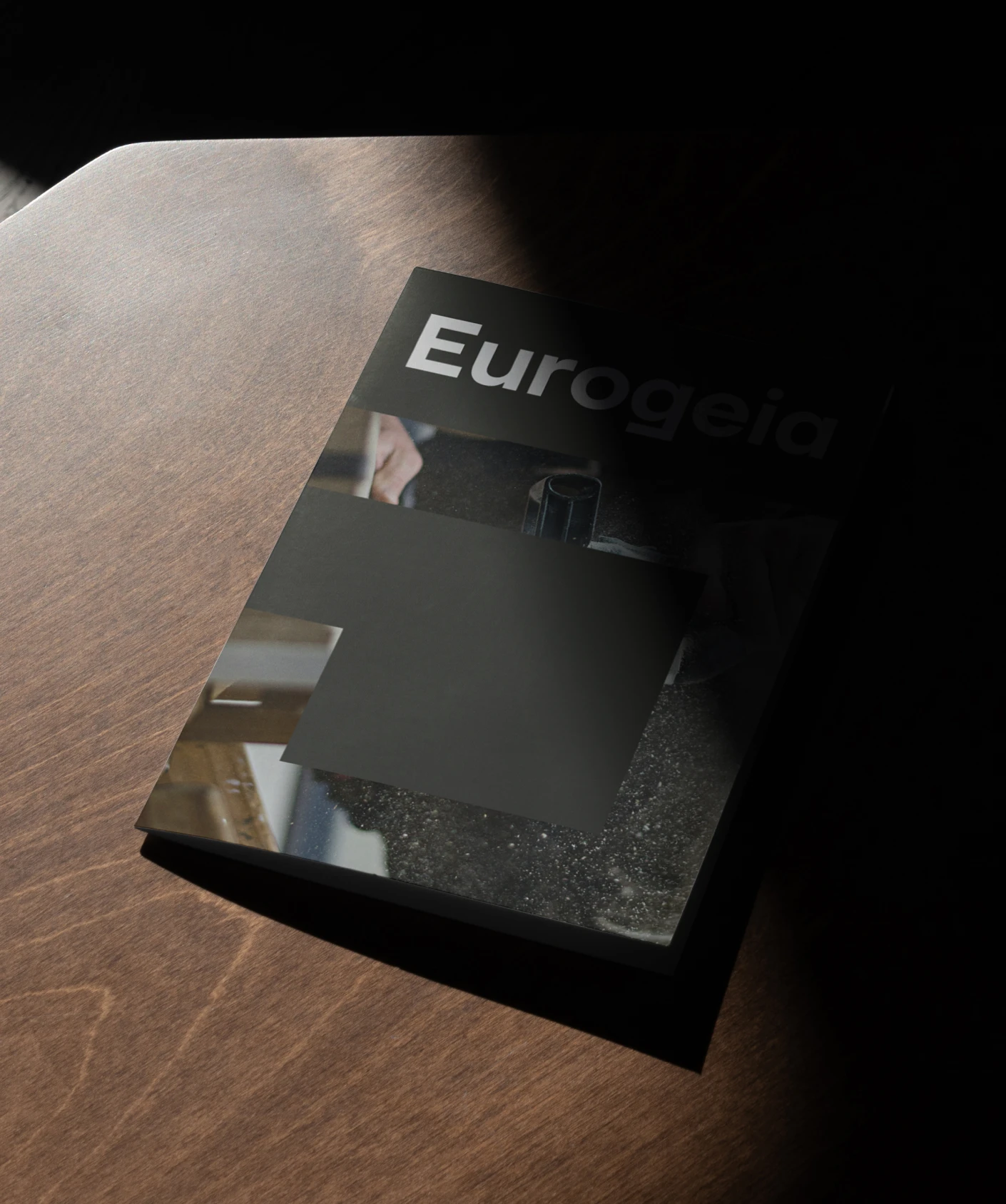
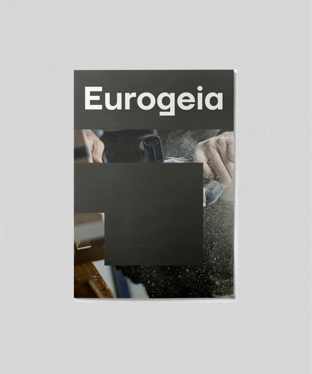
Brand Stationery
Img. 1
Brand Stationery
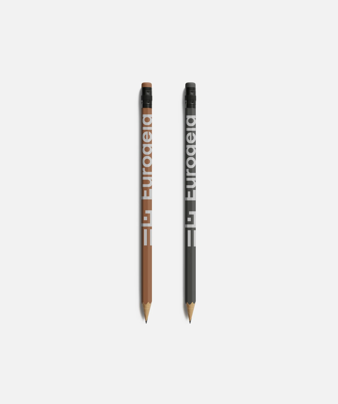
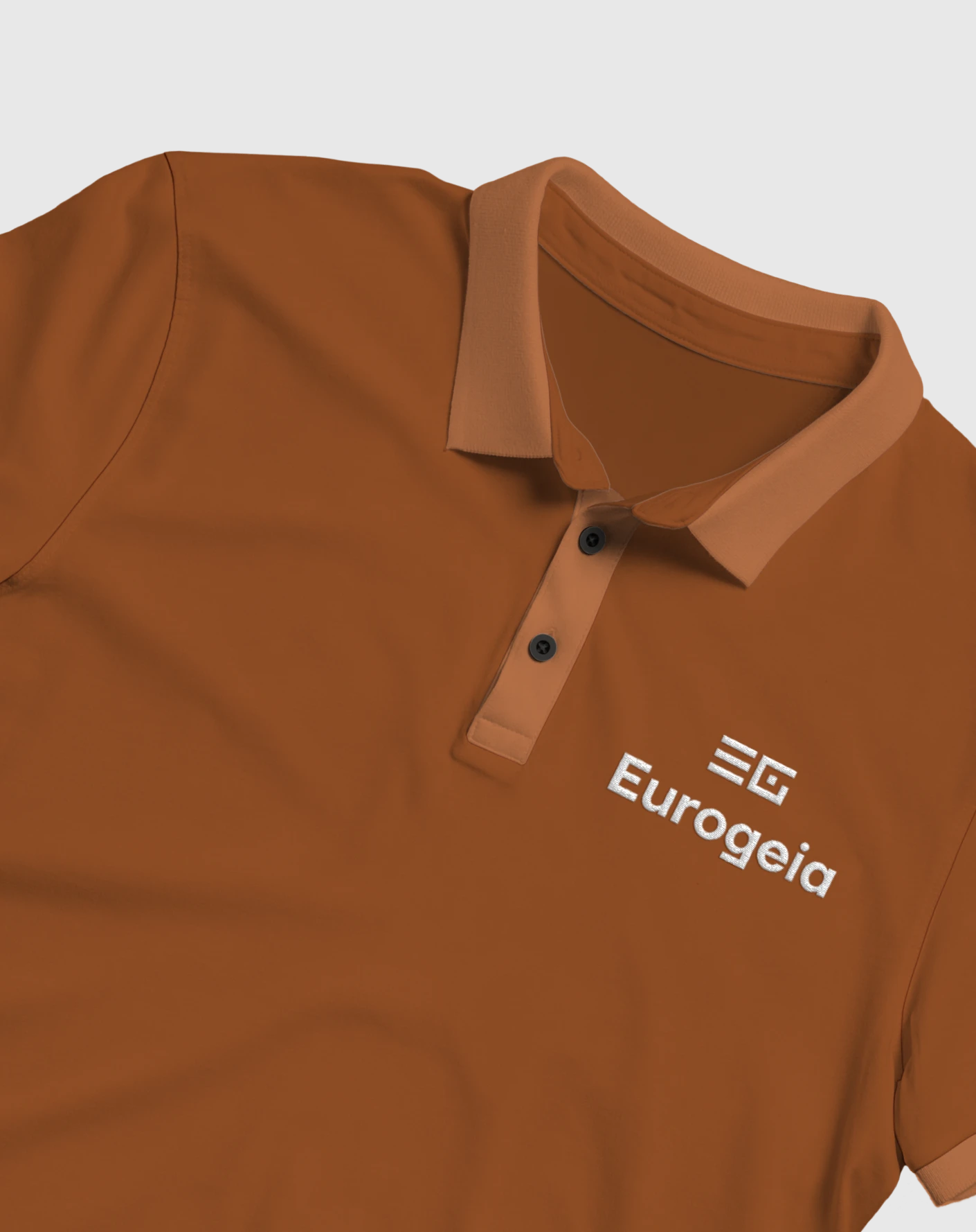
The typography is modern and elegant, matching the new logo’s aesthetic and enhancing the brand’s sophisticated image. The color palette, featuring wood tones and grays, evokes authenticity, durability, and a sense of modernity.

Diversity is the strength of the brand, a manifesto of inclusion and unity. Rebounty is an inclusive brand by everyone and for everyone, a brand that champions gender freedom and diversity. Choose your colors was the chosen motto.
Img. 1
Brand Stationery