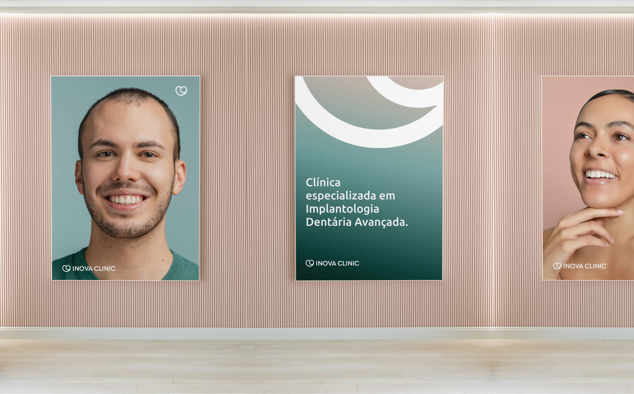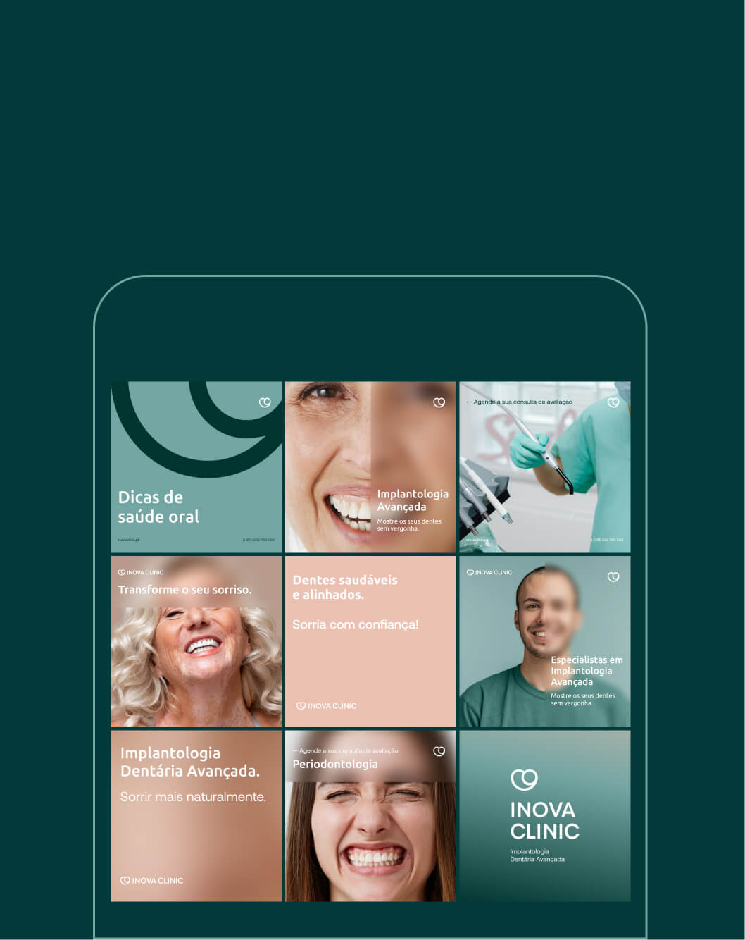
INOVA is a dental clinic specializing in advanced implantology. With over a decade of experience, it has become a trusted leader in the field. Backed by a team of highly qualified professionals, INOVA is committed to restoring smiles and rebuilding patient confidence.

The goal was clear: to highlight excellence in advanced implantology. To translate this specialization into the visual identity, the logo was designed based on the symbiosis between the dental implant and the tooth
— two elements that, together, form the solid foundation of oral health. This symbol reflects precision, personalization, and reliability, key characteristics of INOVA.

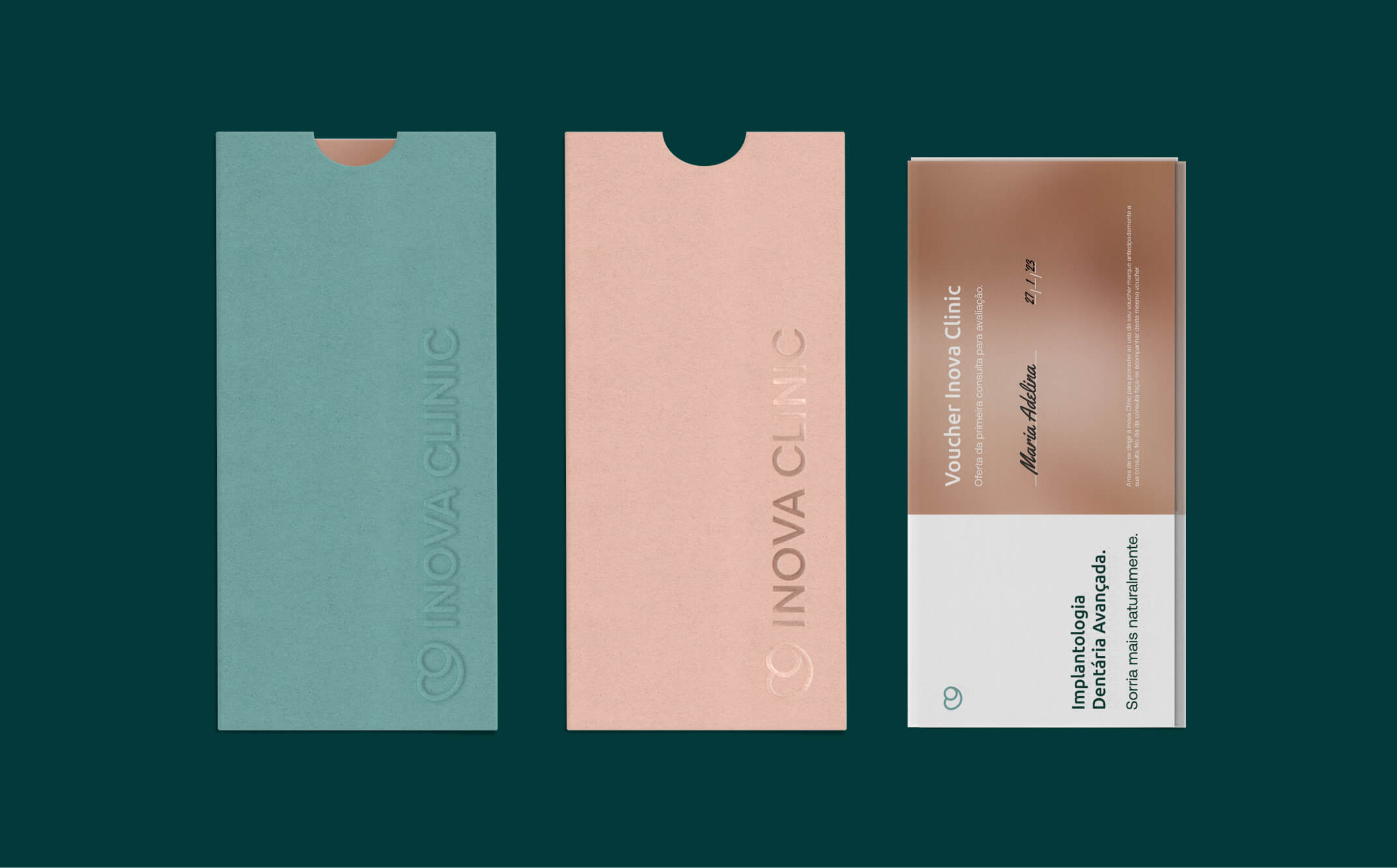
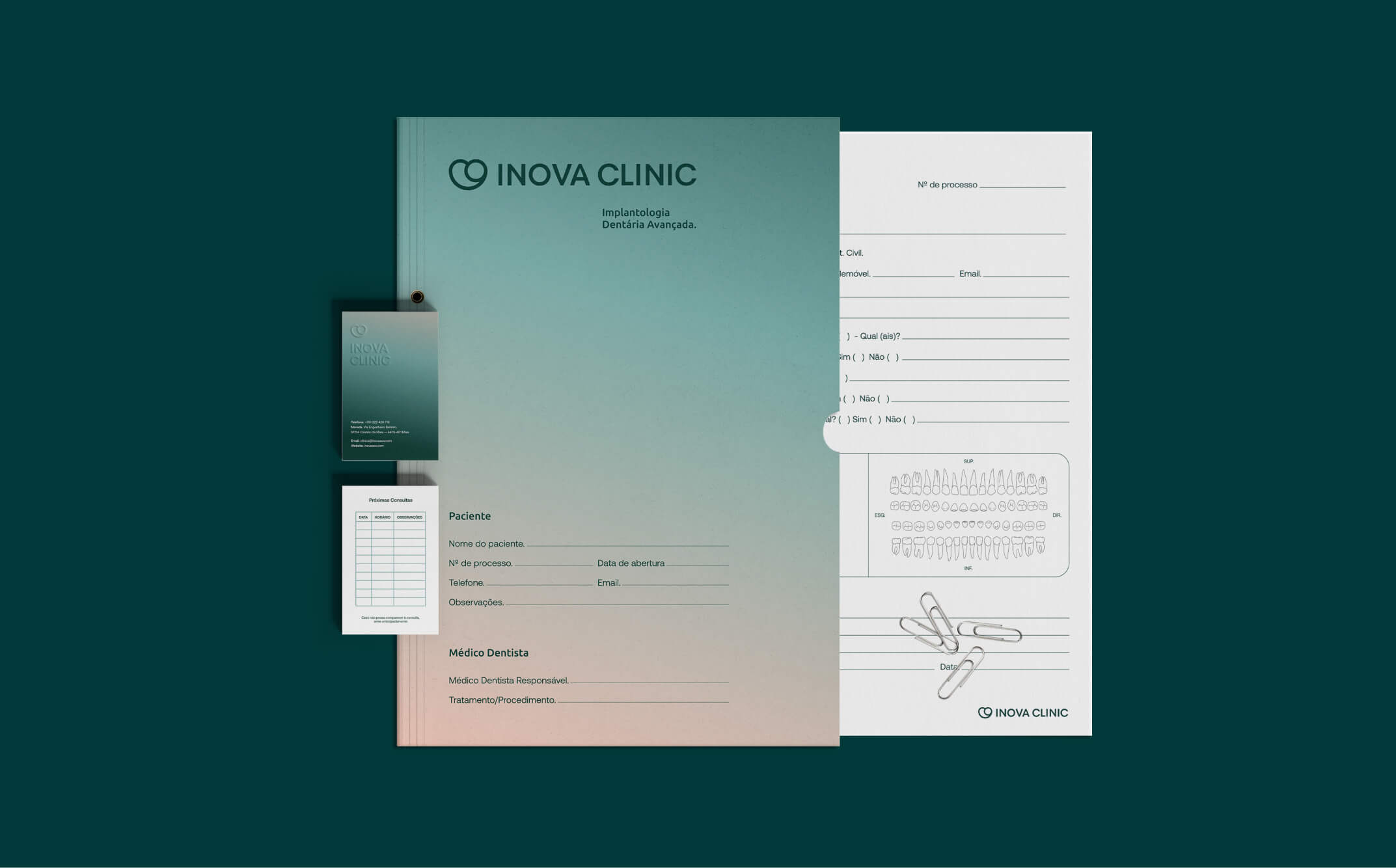
The color palette was carefully selected to convey the values of dental health: the light blue evokes trust and serenity, while the neutral tones reinforce stability and professionalism. Together, these colors not only communicate experience but also the balanced approach INOVA takes in the care and restoration of oral health.

Img. 1
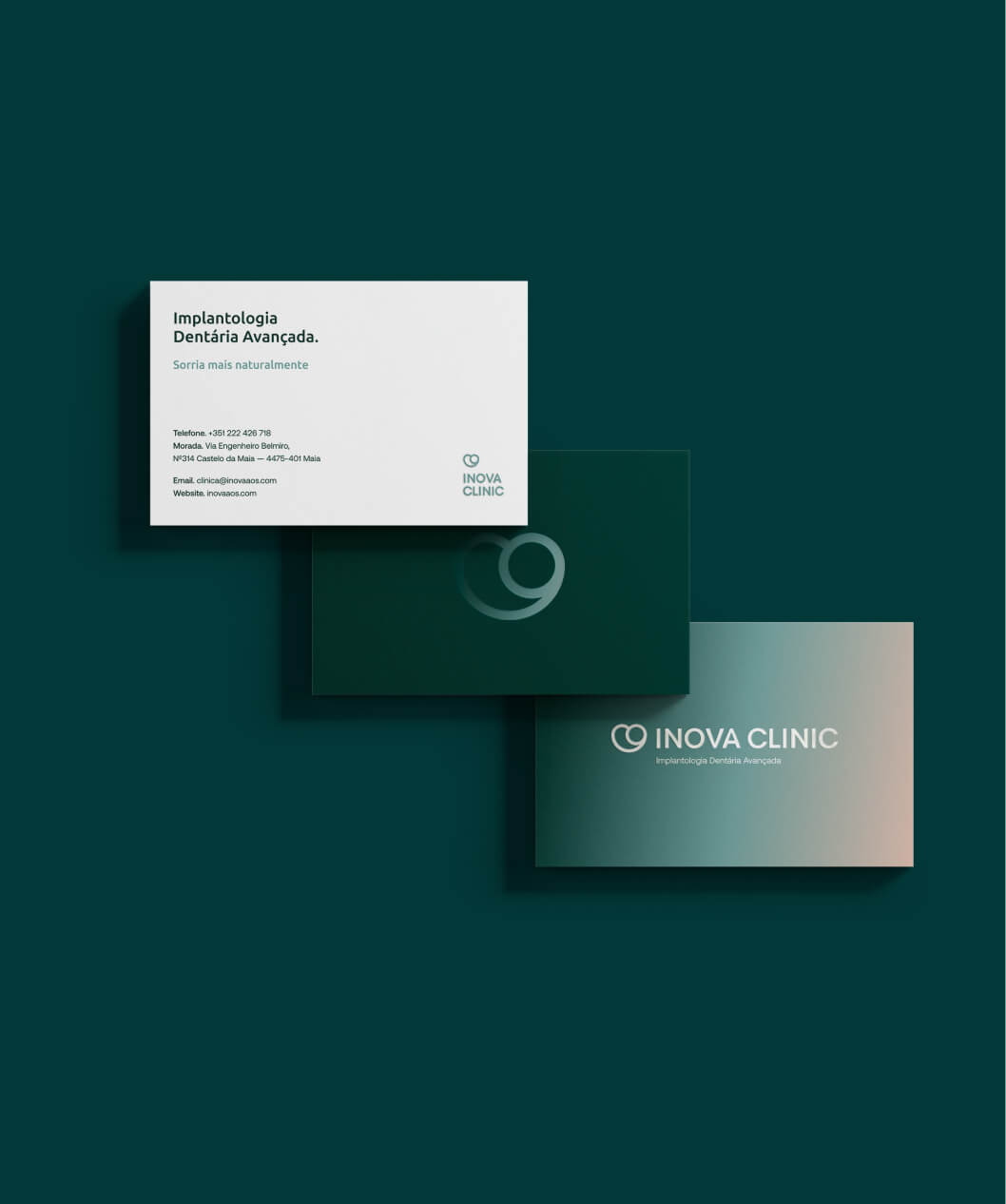
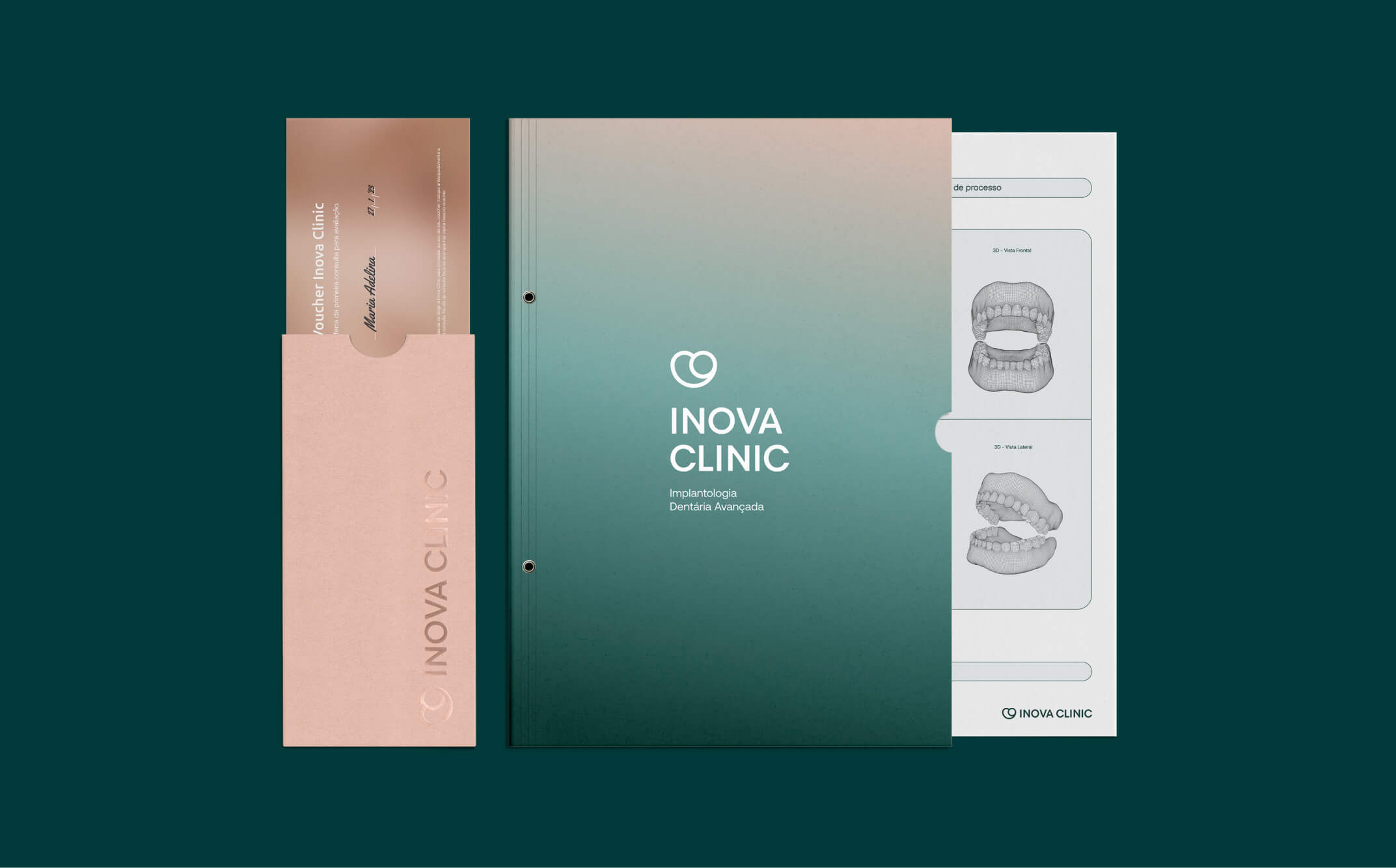
Brand Stationery




Img. 1
Brand Stationery
Through this rebranding, INOVA reinforces its expertise in advanced implantology, conveying confidence and innovation through a visual identity that reflects its core values. The new brand is not just a reflection of technical expertise, but also a commitment to patient well-being and health.
