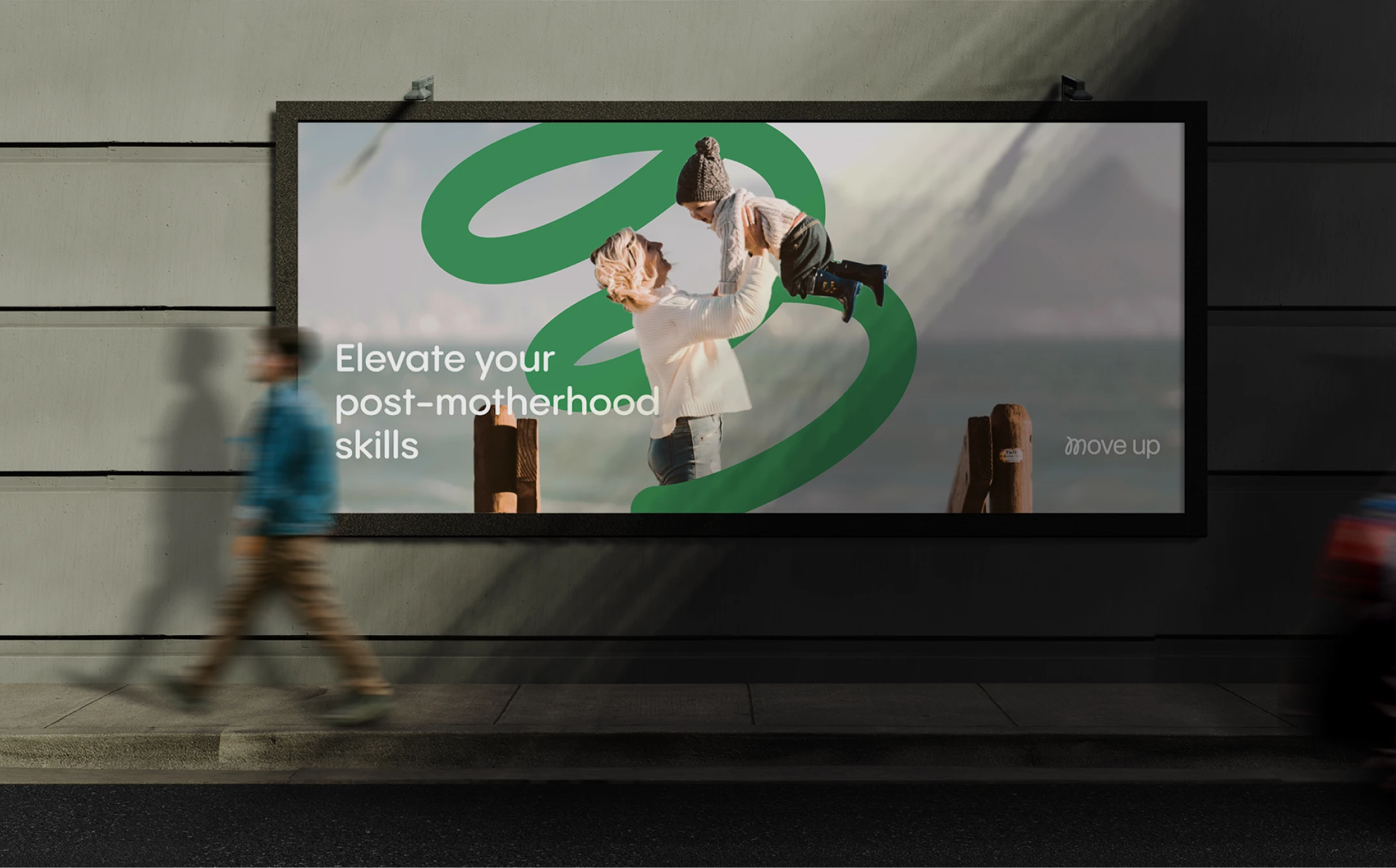
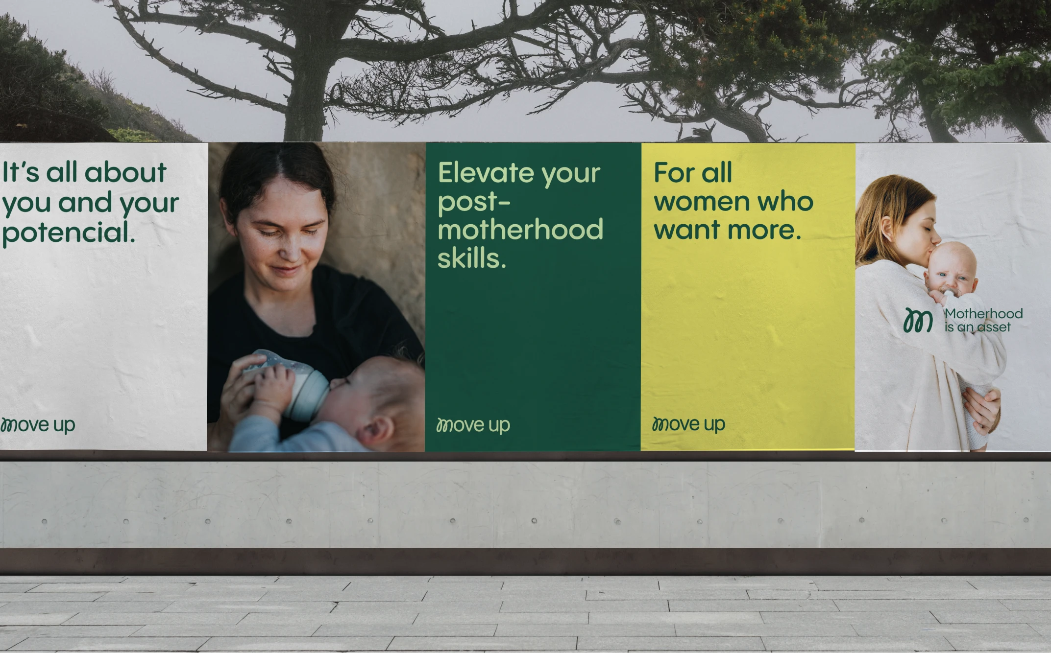
Move Up is a European Union-funded project aimed at helping mothers return to education and the workforce. It also seeks to raise awareness among trainers, education stakeholders, and employers about the importance of developing skills to support mothers’ integration into the workforce.
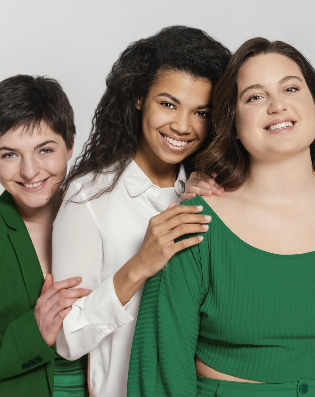
The visual identity of Move Up clearly and intuitively reflects its mission: sensitive, respectful, and mature.
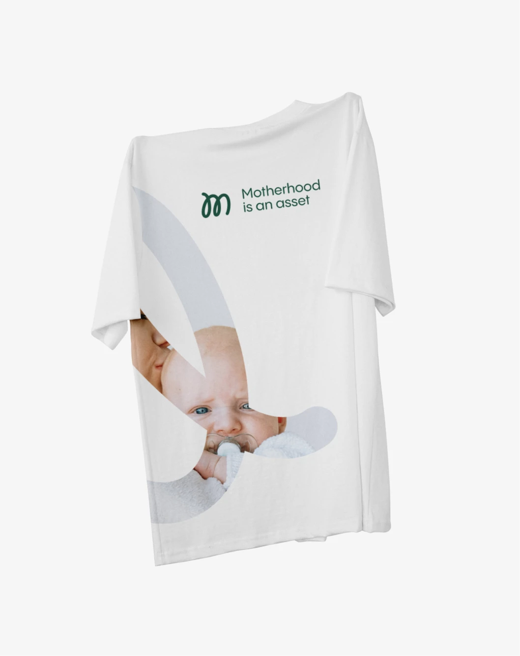
The symbol was inspired by the natural form of the letter "M", which represents more than just a letter — it is the icon of movement, transformation, and evolution. The rounded typography complements this idea, maintaining accessibility and approachability.
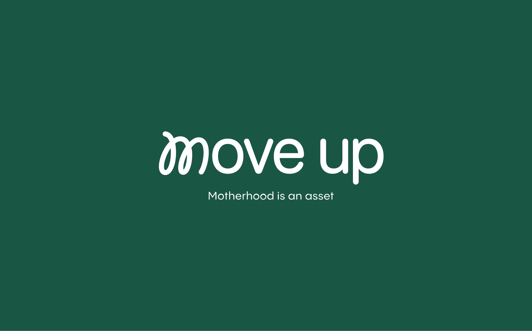
Move Up combines a simple secondary typography with a purposeful color palette symbolizing hope, perseverance, and growth. These elements work together to communicate the project’s message of support and opportunity for women returning to the workforce.
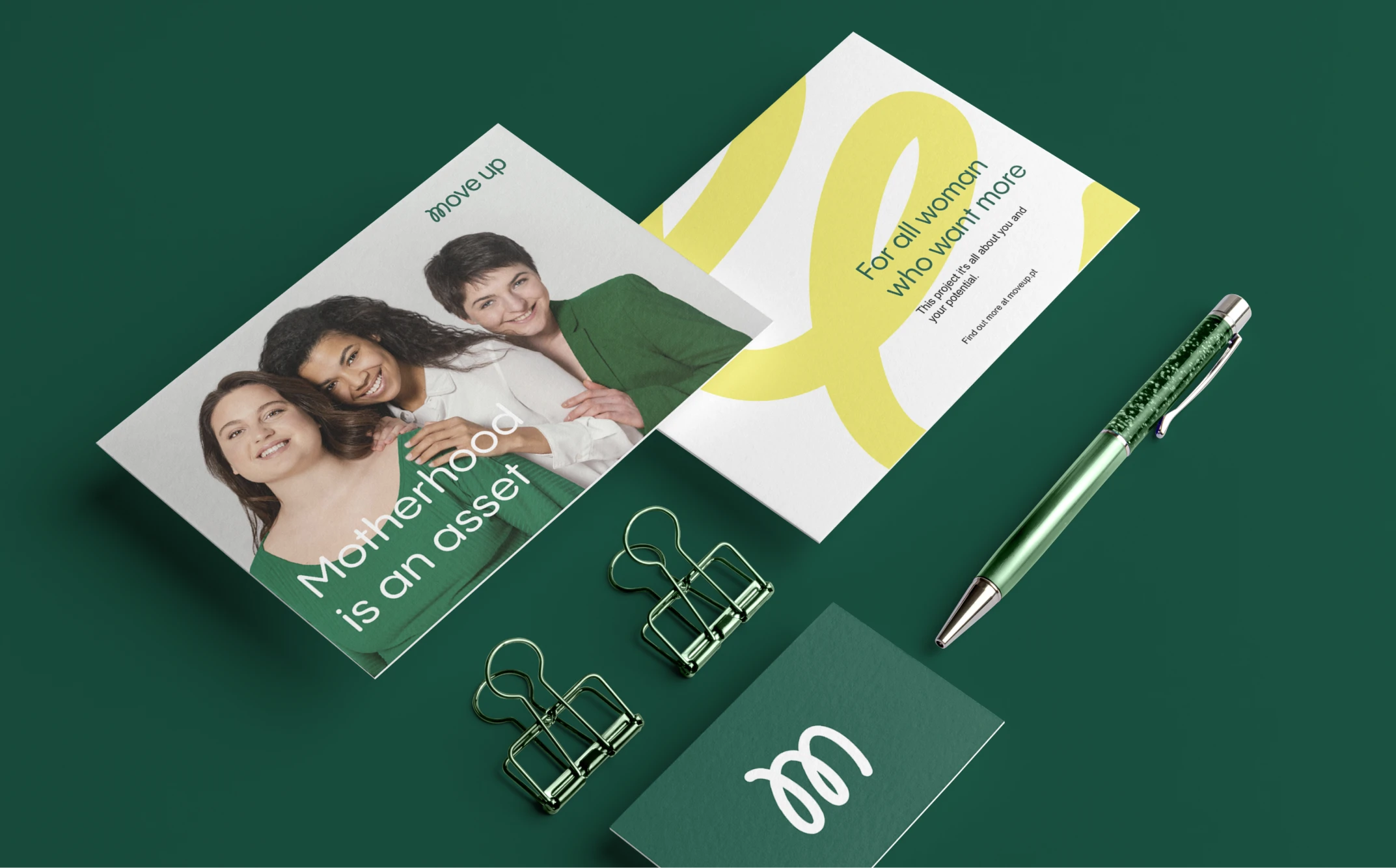
Img. 1
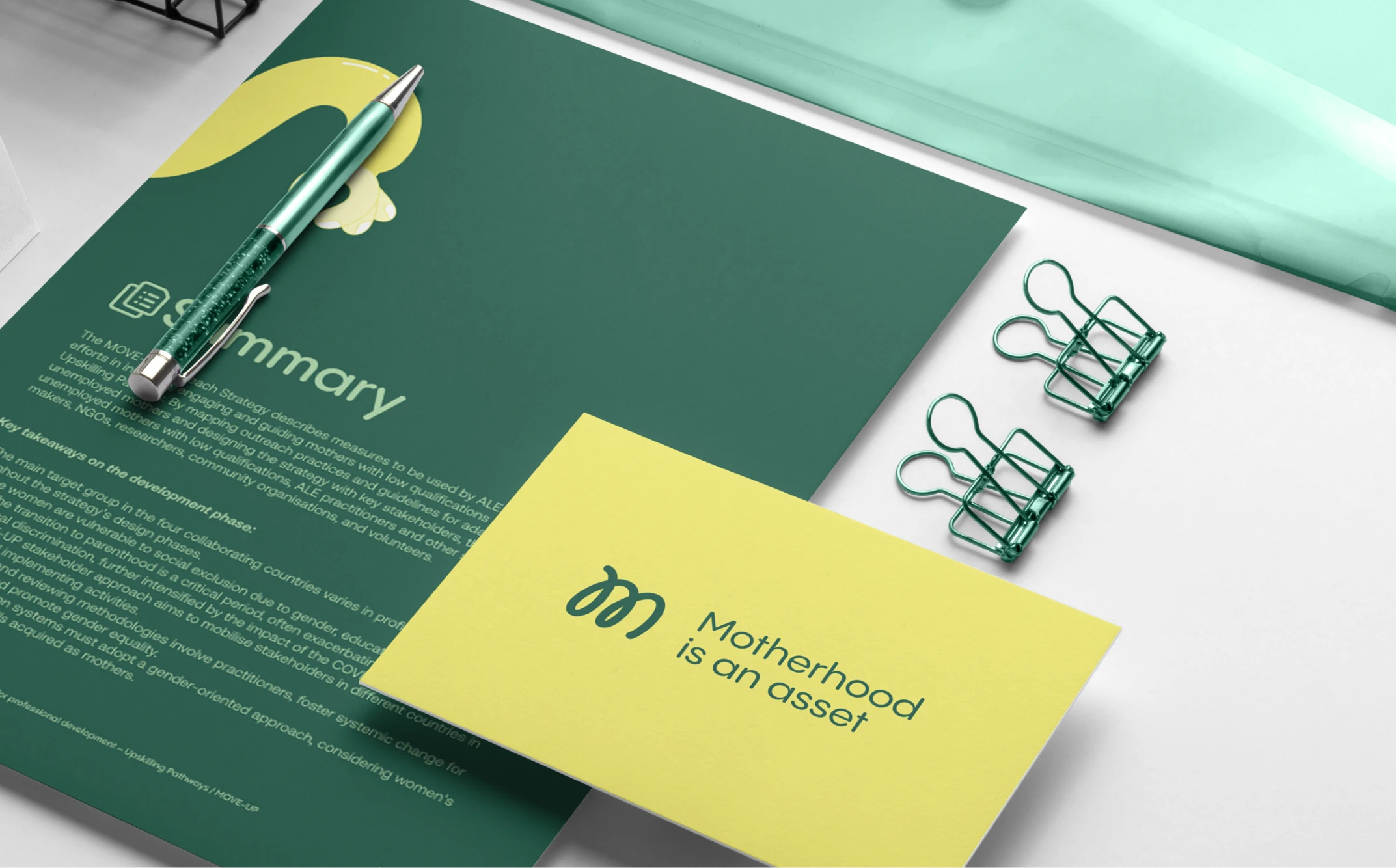
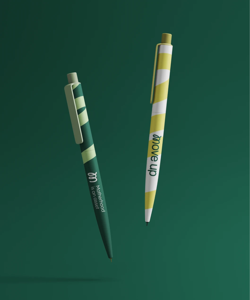
Brand Stationery
.jpg)
Img. 1
Brand Stationery
The new branding of Move Up helps to embody its mission through a thoughtful visual identity that reinforces its core values of hope, growth, and resilience, offering mothers the opportunity to confidently reintegrate into education and the workforce with support.