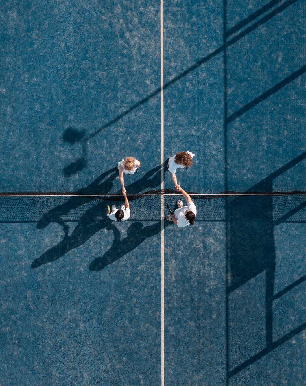
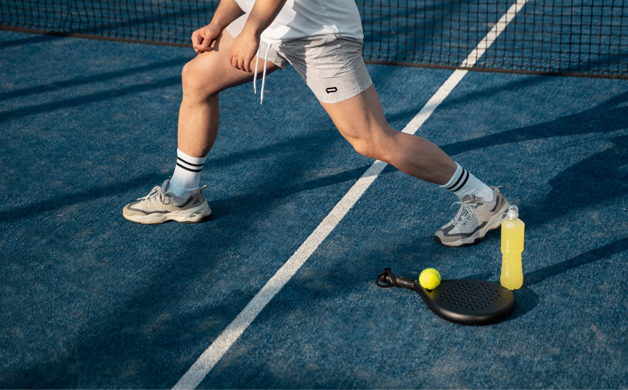
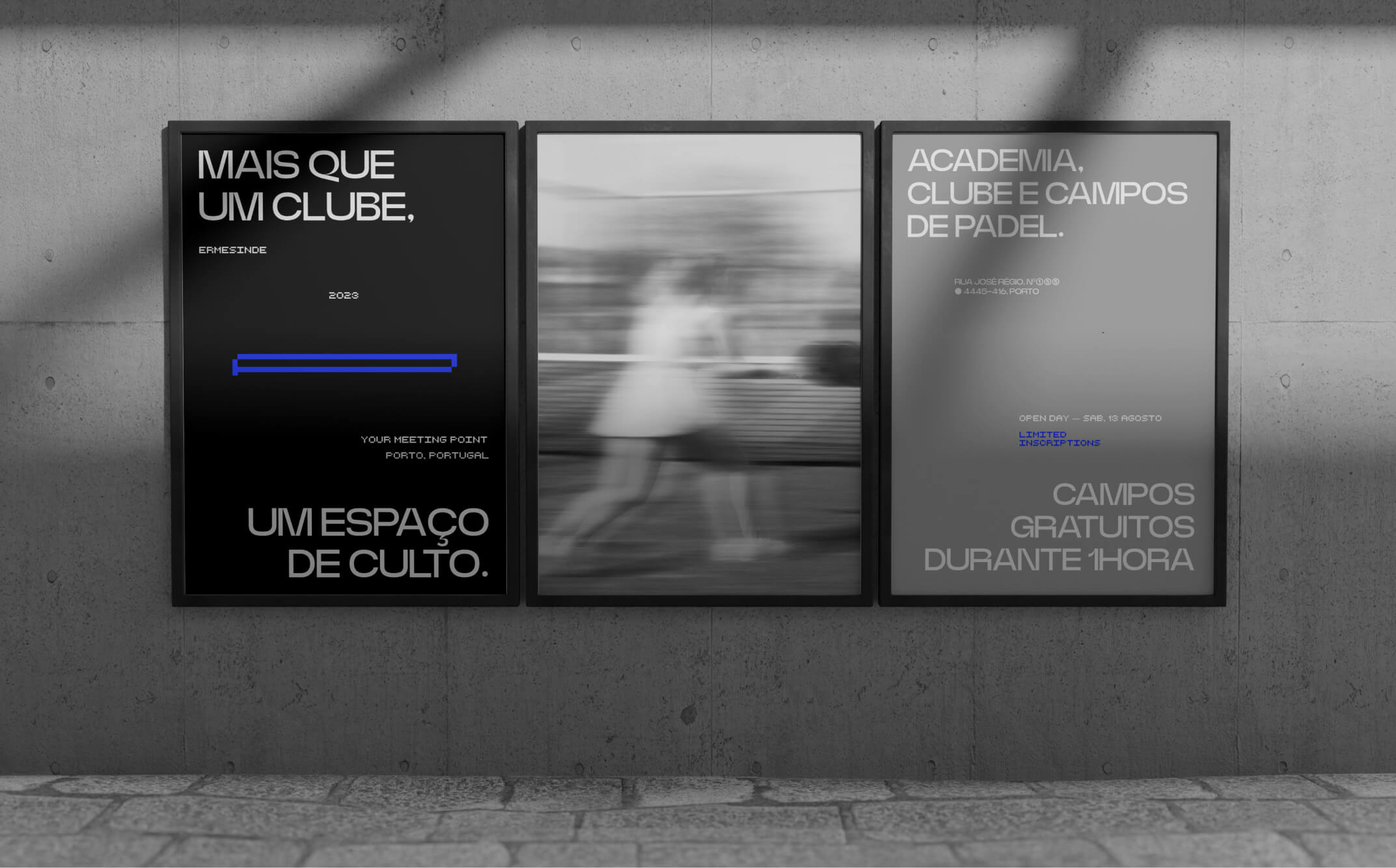
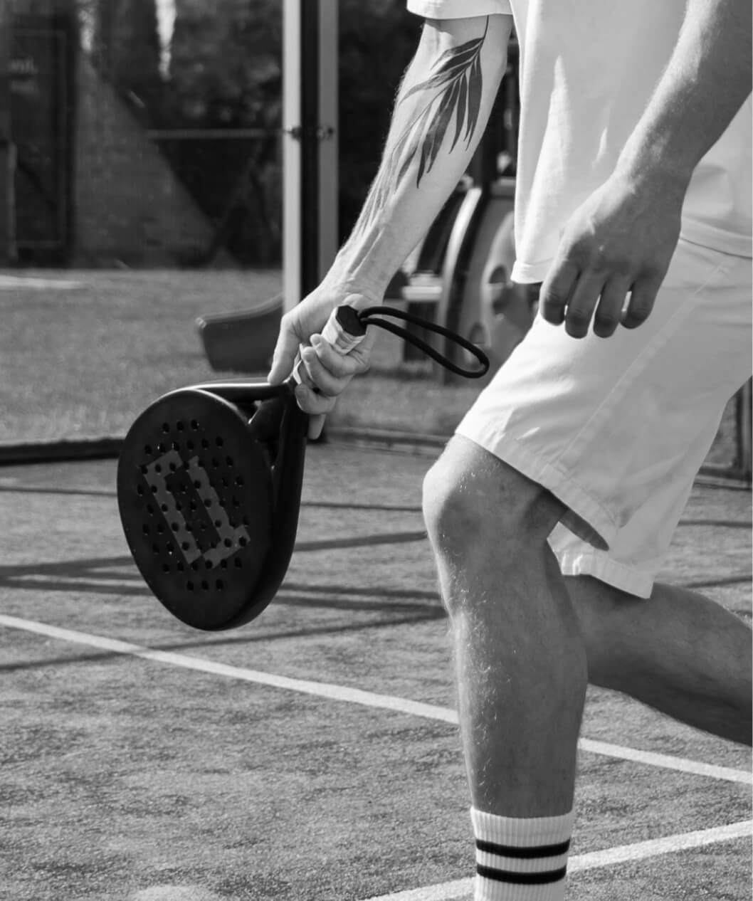
Padel Point is the new club in Ermesinde where padel is played with intensity. Opened in 2022, the club came to accelerate the pace of the city, offering courts and a gym dedicated to the sport, where every "smash" makes a difference.
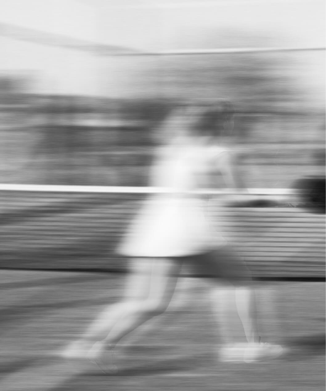
The goal was simple yet ambitious: to create an identity as young, dynamic, and modern as the sport itself, communicating in a relaxed manner while maintaining values of trust and precision.
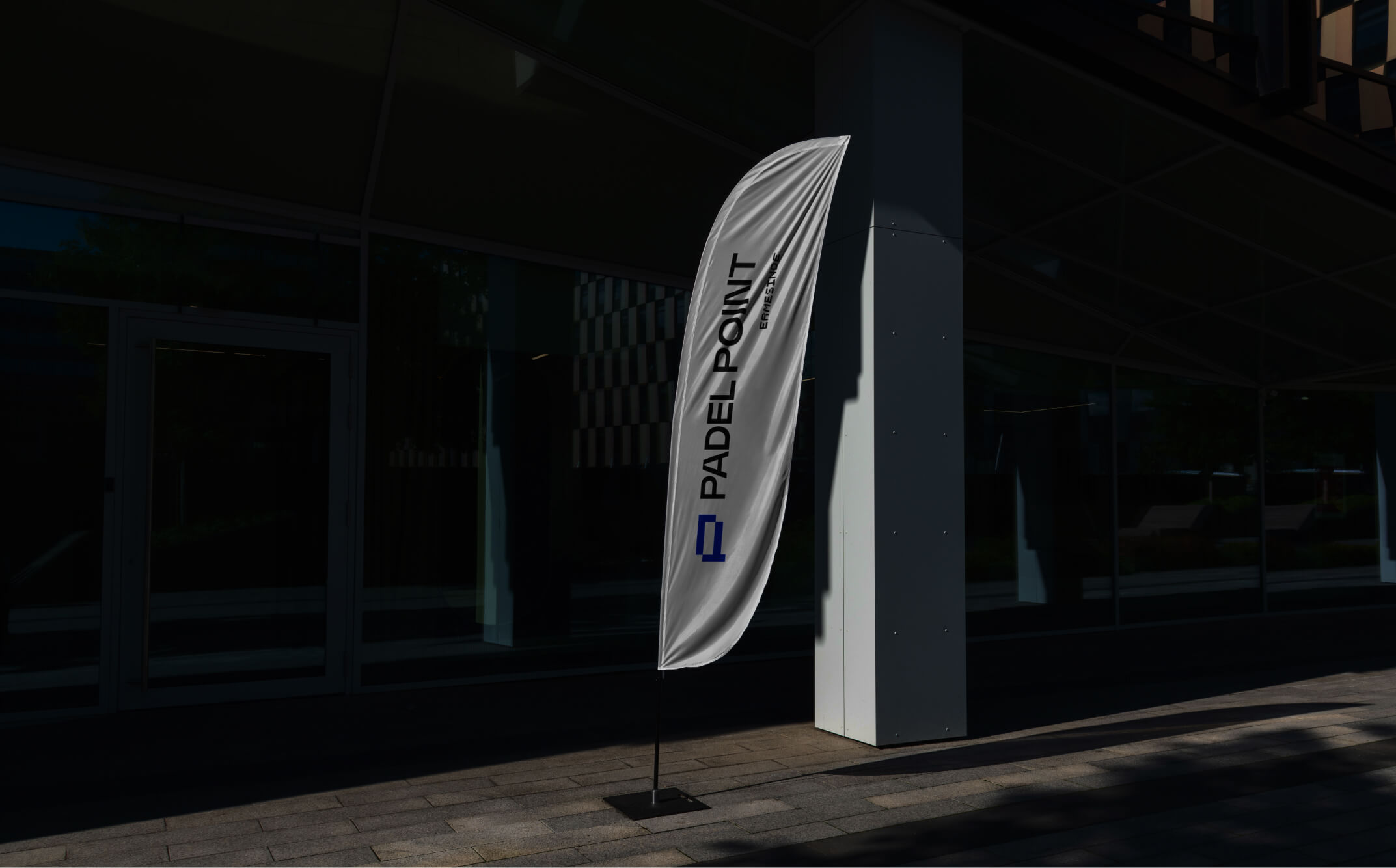
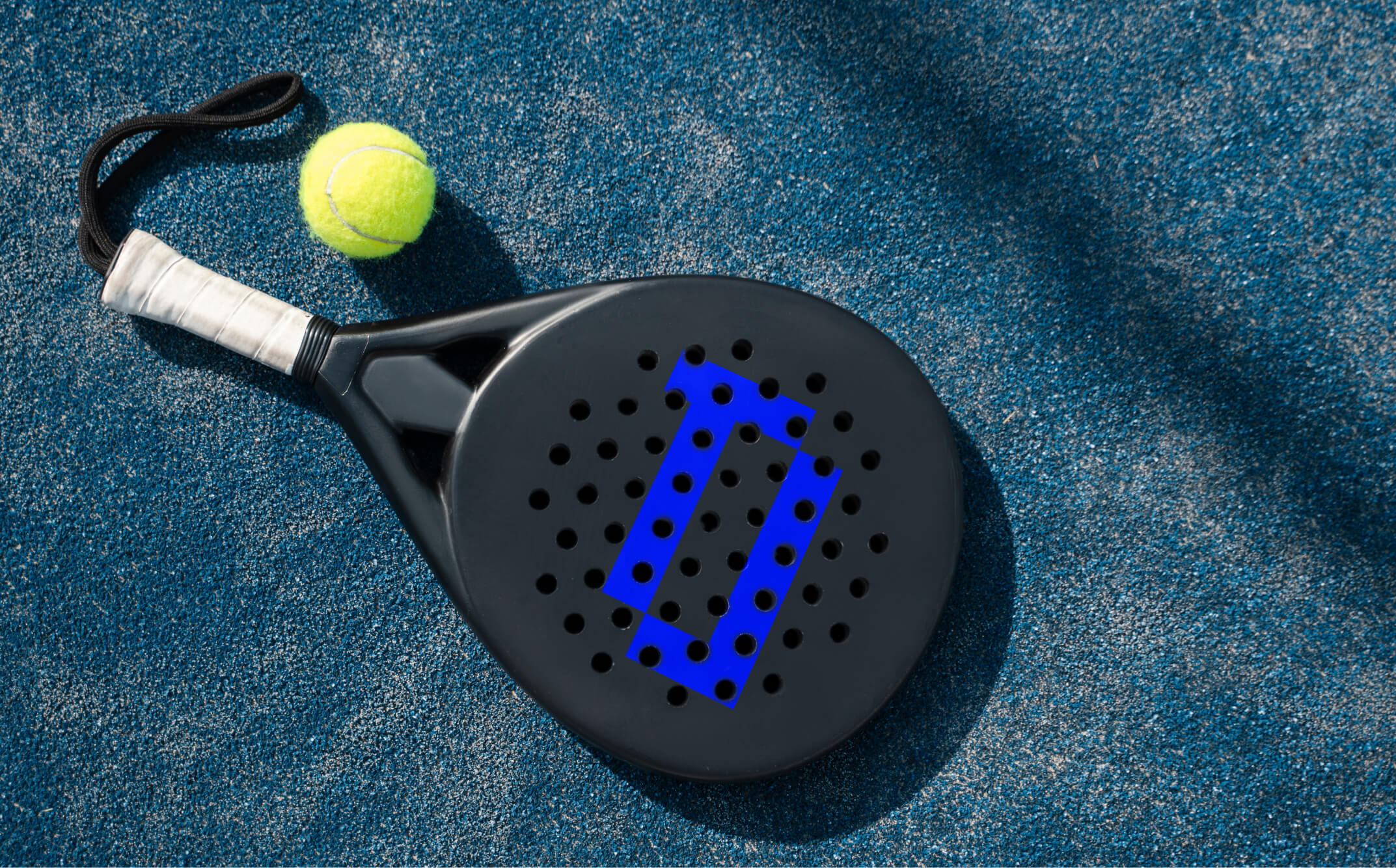
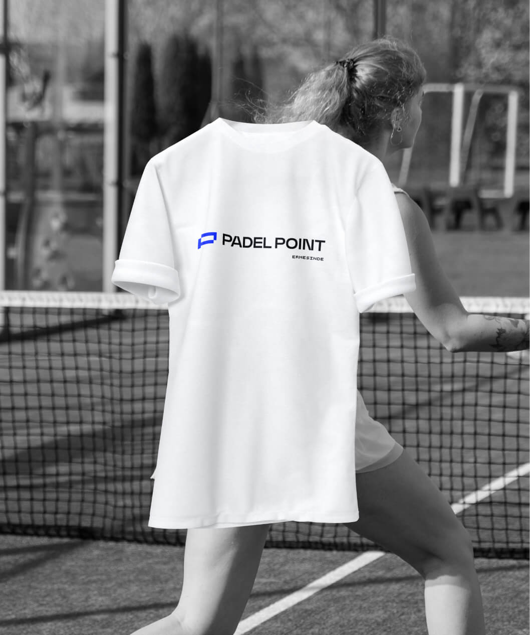
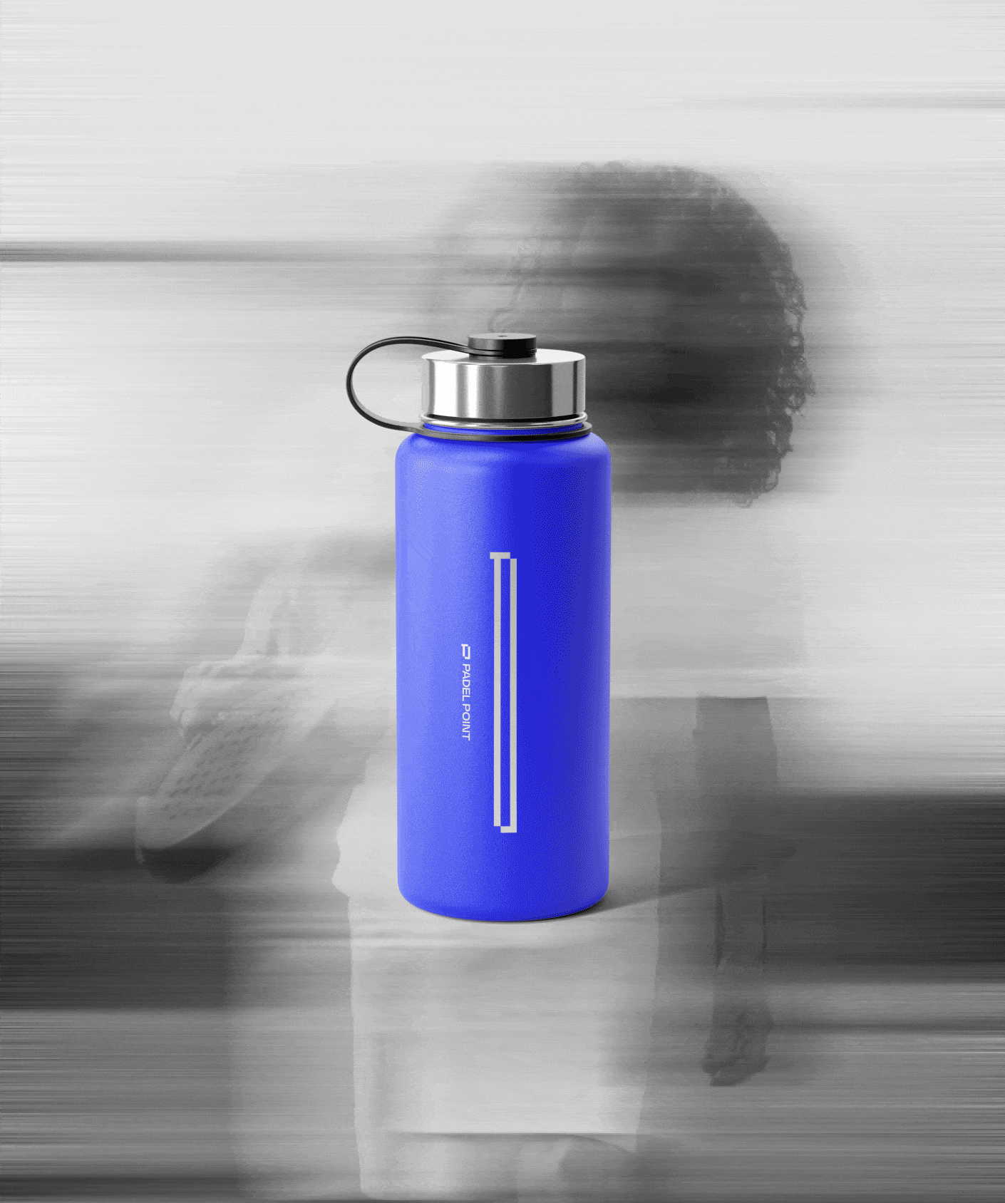
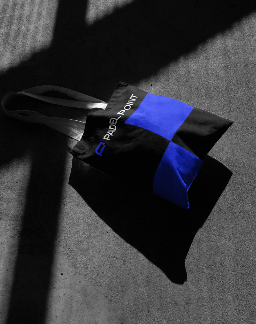
The logo was inspired by the padel court, with the "P" deconstructed and the simple lines of the walls that keep the ball in play. The chosen colours—blue, reminiscent of the courts' surface; green, the vibrant colour of the ball; and black and grey, adding elegance and a touch of modernity—reflect the energy and precision of the sport.
Img. 1
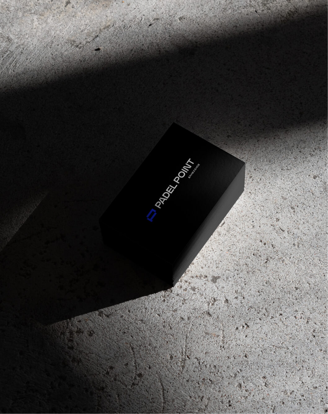
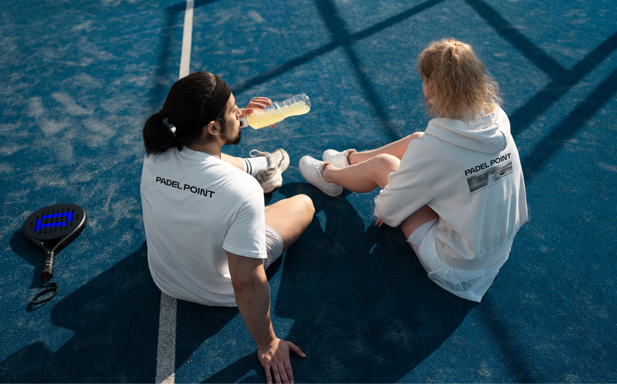
Brand Stationery
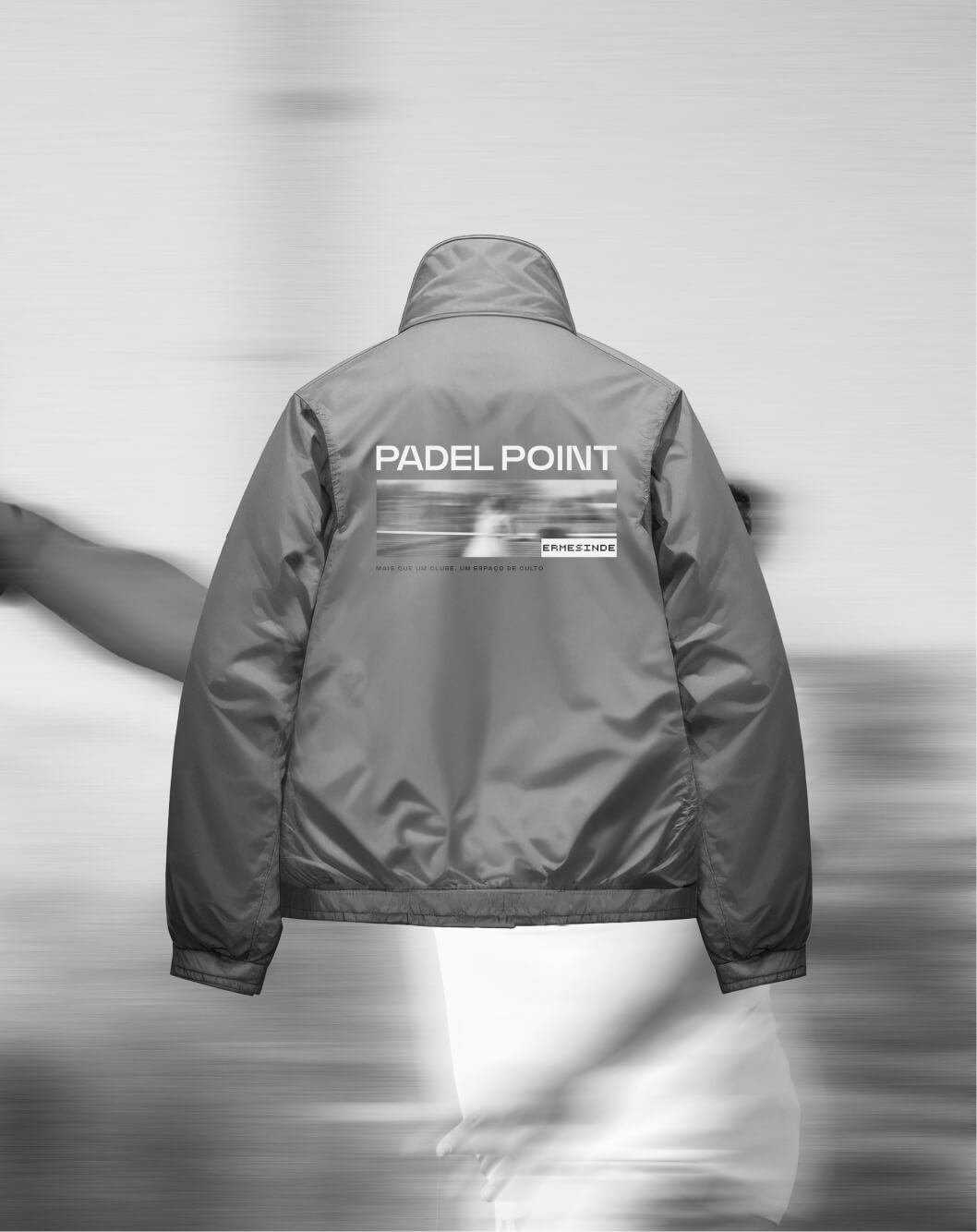
More than just a club, Padel Point is a meeting point. Here, the only thing that never stops is the ball. Located in Ermesinde, it is the first padel club in the area and the best place to play, train, and relax.
Img. 1
Brand Stationery
Img. 1
Brand Stationery
Img. 1
Brand Stationery
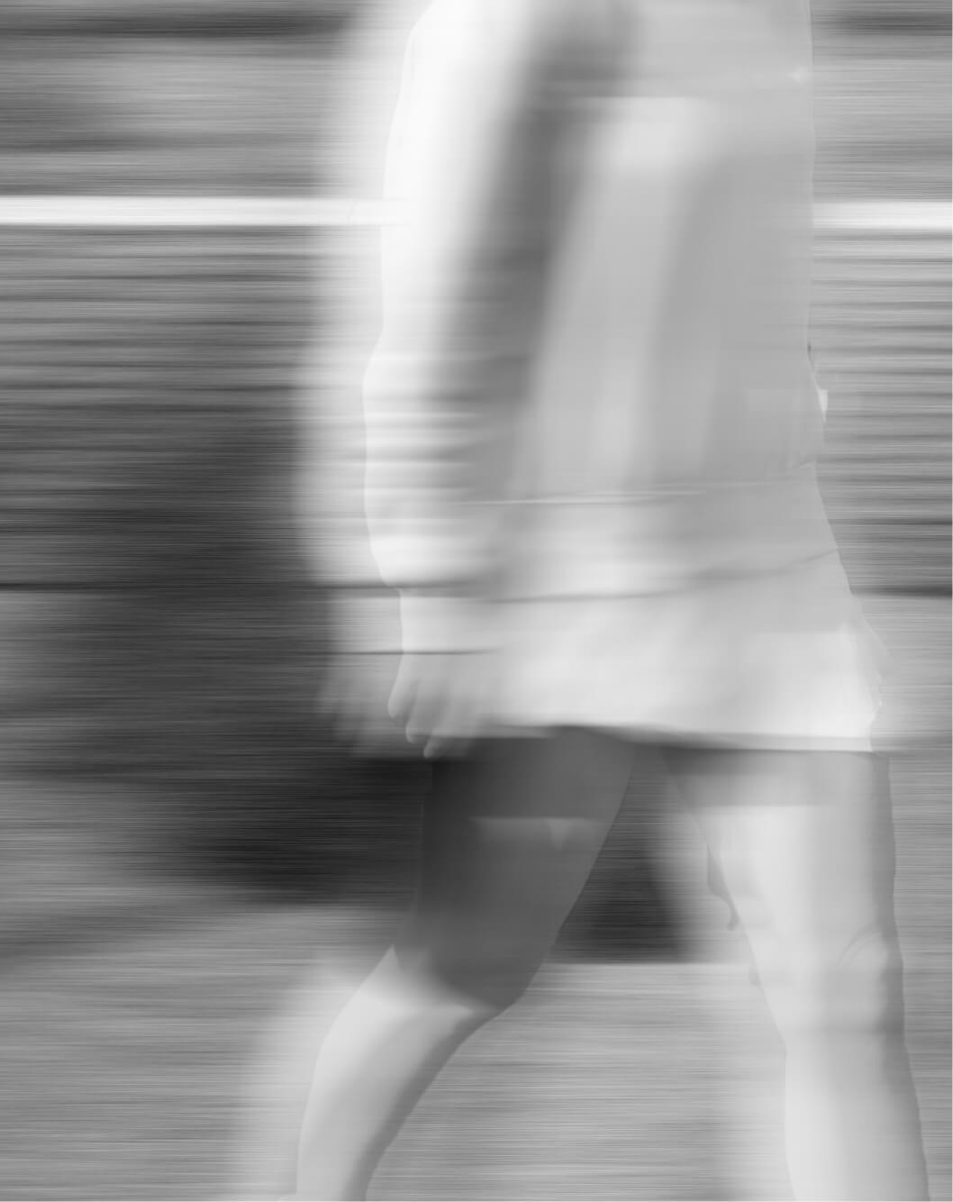
The visual identity was designed to speak directly to the audience, clearly conveying the essence of the brand: vibrant, energetic, and in constant motion, just like padel, where every point counts.